MOSP
문은 관계의 공간이다
2021
Category bakery cafe
Realize Architecture & space Design, Space Coonstruction,
Branding supervision
Completion Date 2021. 07
Location 27-5, munwha-dong, Jung-gu, Daejeon, South Korea
Graphic sparks edition
Landscape Anmadang The Lab
Photography Park Woo Jin
KR
각 창들이 의미하는 바
창을 통해 담기는 모습
모습을 담는 창의 모습
벽마다는 조금씩 다른 얼굴로 저마다의 표정을 짓고 있다. 내벽에는 별다른 장식이 없다. 모두 백색 톤으로 같은 재질이다. 사람 간에 깊고 진솔한 대화가 오갈 때 꾸밈없는 본모습을 보여주어야 진정성이 있는 것처럼 이 벽들이 짓는 표정은 꾸밈없고 솔직하다. 크기가 조금씩 다른 창들을 통해 공간의 모습들이 담긴다. 그 안에서의 모습들은 어느 때보다 솔직한 모습들이다.
EN
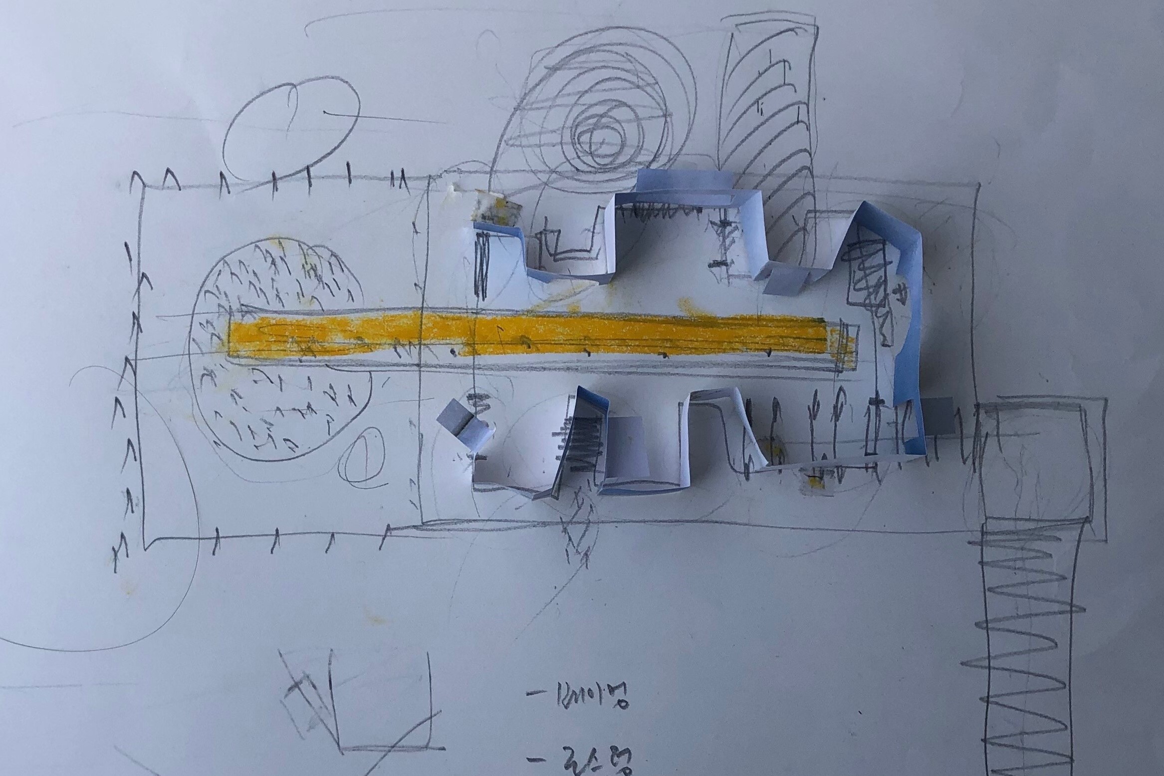
There are various form of relaxation. To capture this, we drew the diverse form of relaxation on a long sheet of paper, then folded another paper, having openings cut out by scissors, onto it. We built MOSP: a place that reflects each individual’s form of relaxation. Openings between these walls act as a vent, making the place a space of relationship, not a confinement. “MOSP”, located in Daejeon city, is under the foot of a mountain. Daejeon’s downtown can be seen from the front, and Bomunsan Mountain from the back. MOSP is located on the top, fifth floor of the building. There are gentle stairs that flow from the ground of Bomunsan up to the cafe, which naturally lead visitors inside. The building has somewhat vertical mass when viewed from the opposite side of Bomunsan. However, when you enter the café from Bomunsan, you’ll experience a low and gentle horizontal mass. Upon entering, the view of downtown Daejeon that unfolds from the terrace feels extraordinary. As you climb the gentle stairs, you’ll see that there is a sense of comfort infused in the interior of the café. We wanted the cafe to be spacious, but not vastly extensive. We wanted a cozy place for people to comfortably relax. We set up a long connected partition having openings and windows to reflect the diverse methods of relaxation.
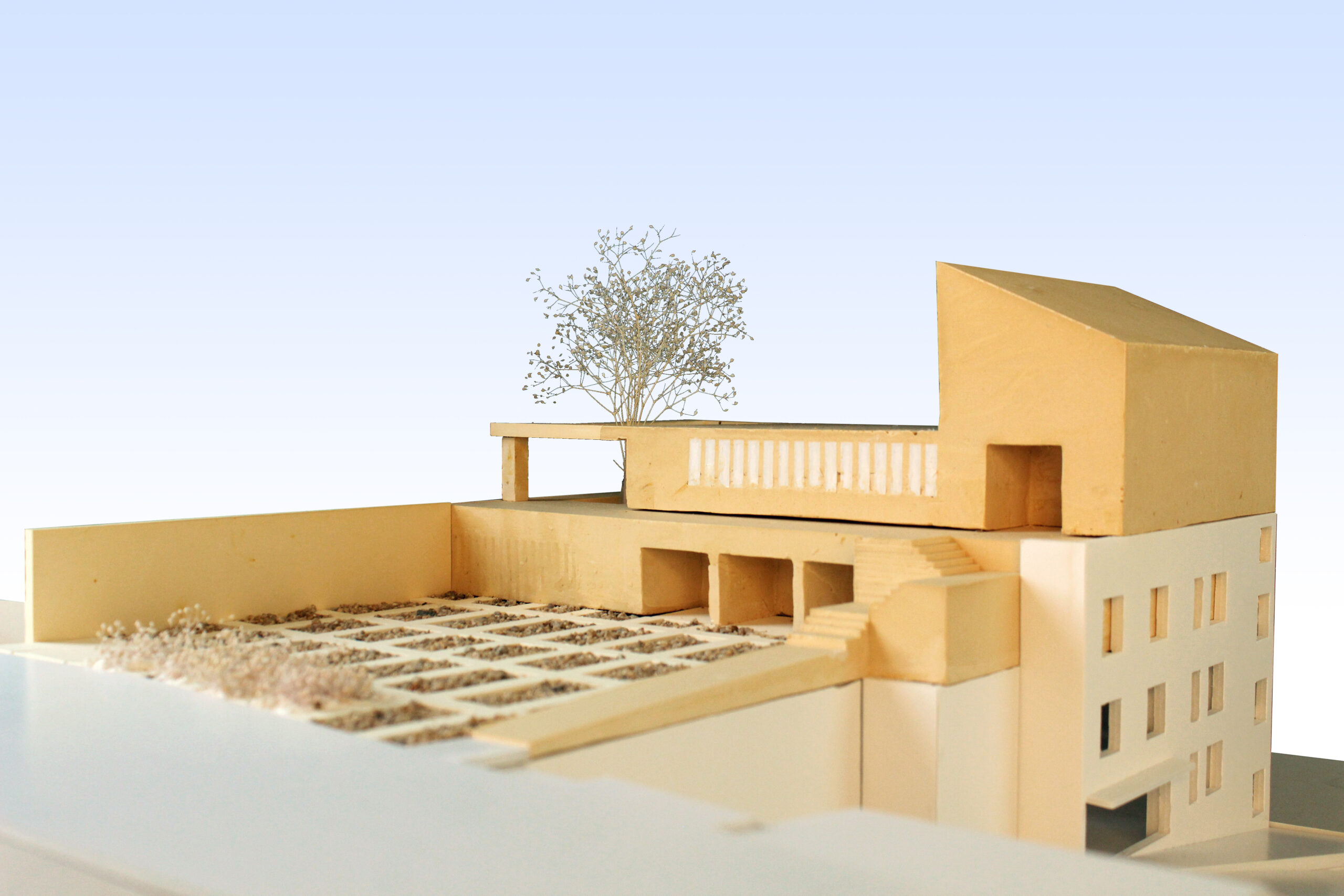
Model
Proposal Mass model
Property of the atmoround
Made: atmoround
©2020 ATMOROUND
Photo
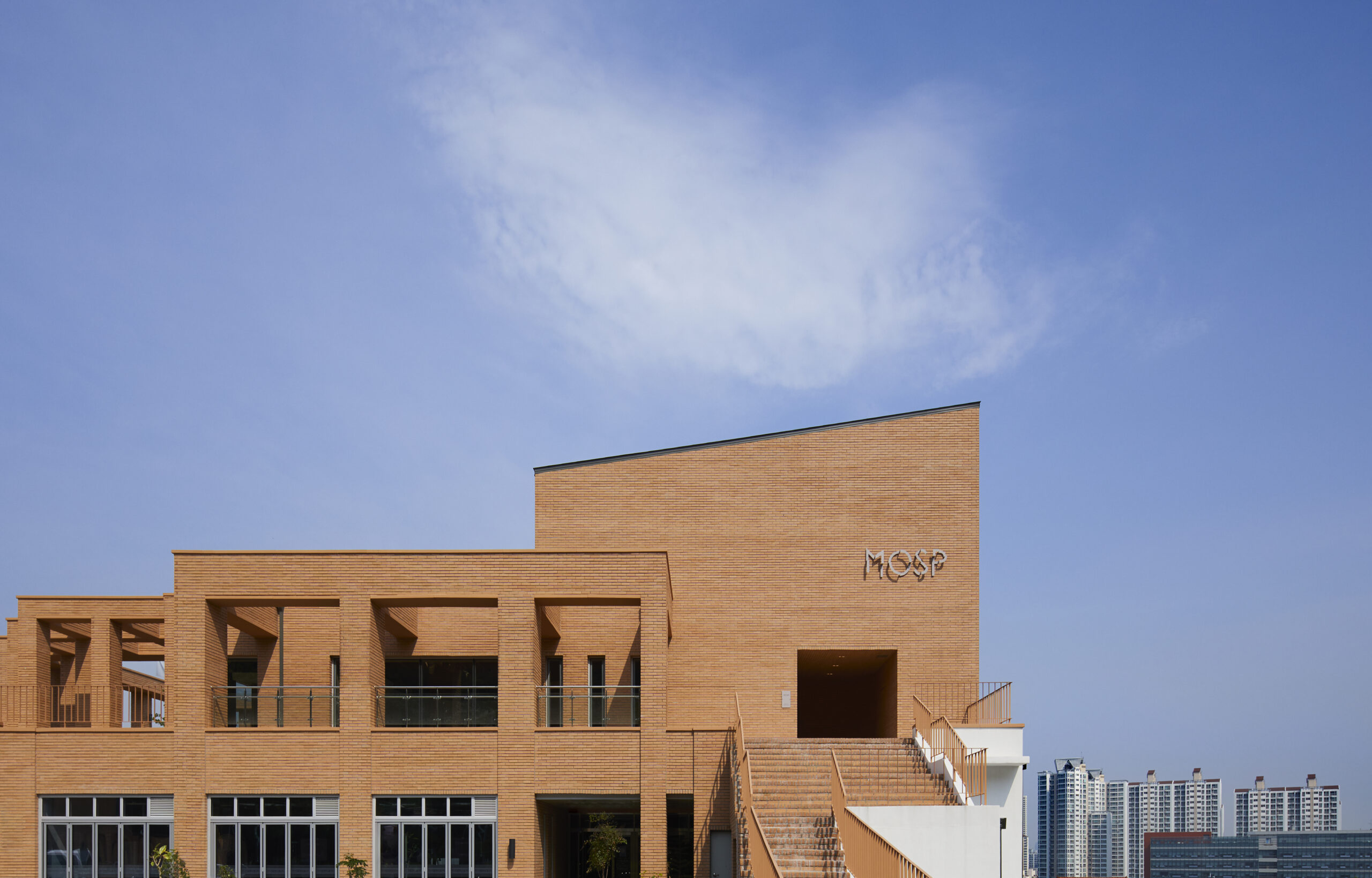
The exterior appearance of MOSP, newly arranged to refresh the previously dry facade of the existing building.
Photo: Park Woo Jin
©2021 ATMOROUND
Photo
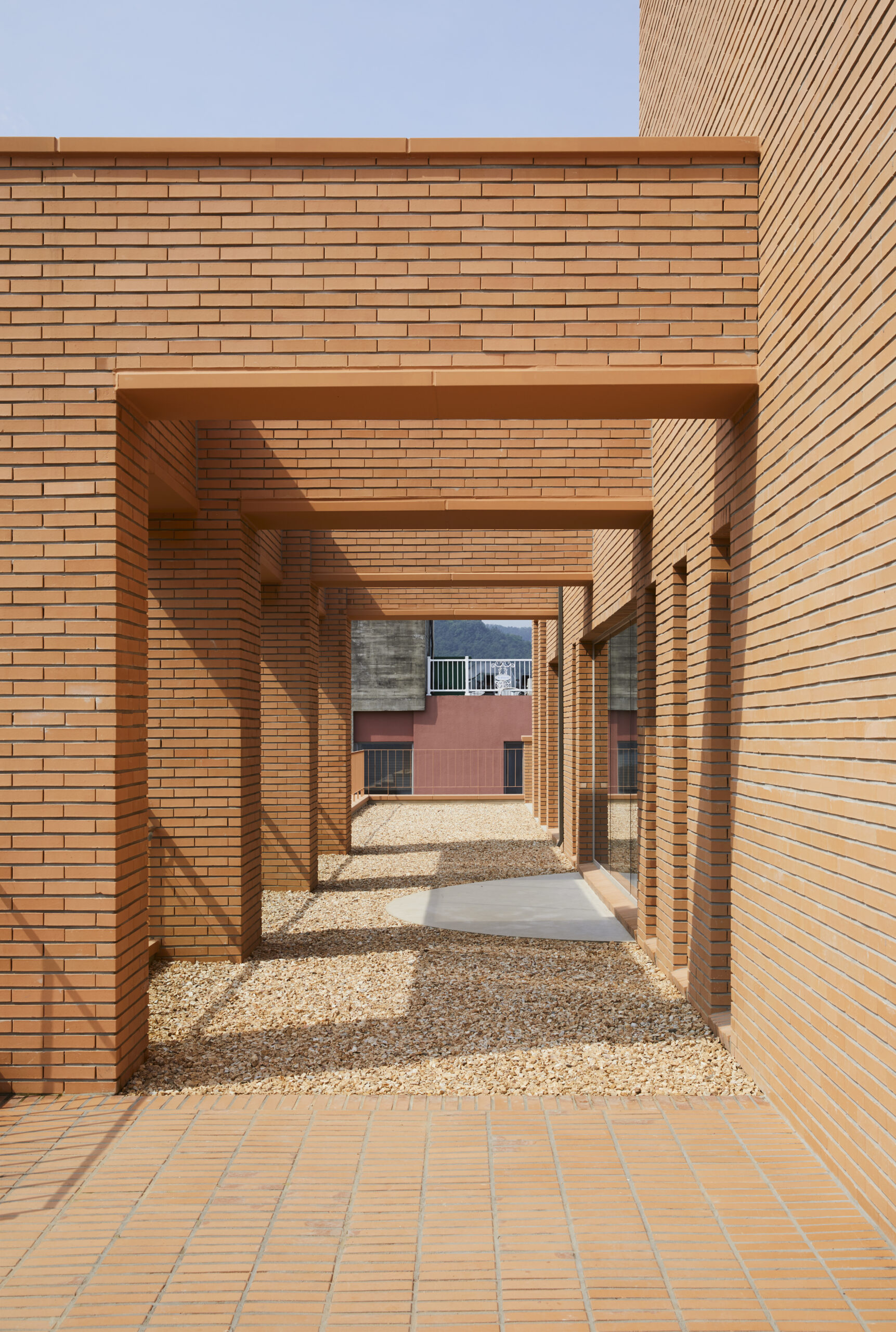
A rectangular frame creates a sense of continuity in the space, and the floor is finished with crushed stones that match the brick color of the exterior walls.
Photo: Park Woo Jin
©2021 ATMOROUND
Photo
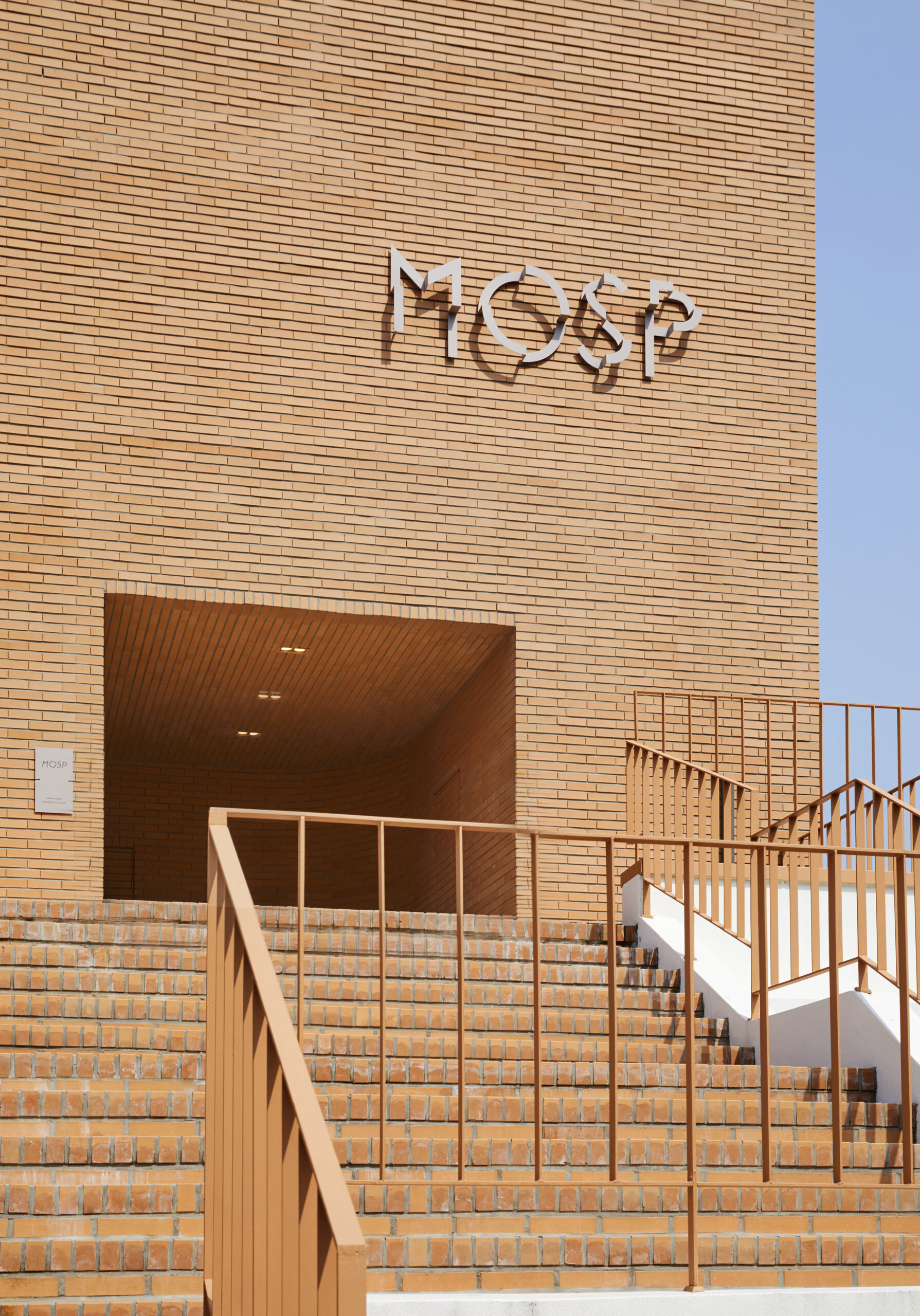
A sign design that aligns with the concept of capturing various forms of rest, appearing different from various angles to showcase a variety of perspectives.
Photo: Park Woo Jin
©2021 ATMOROUND
Photo
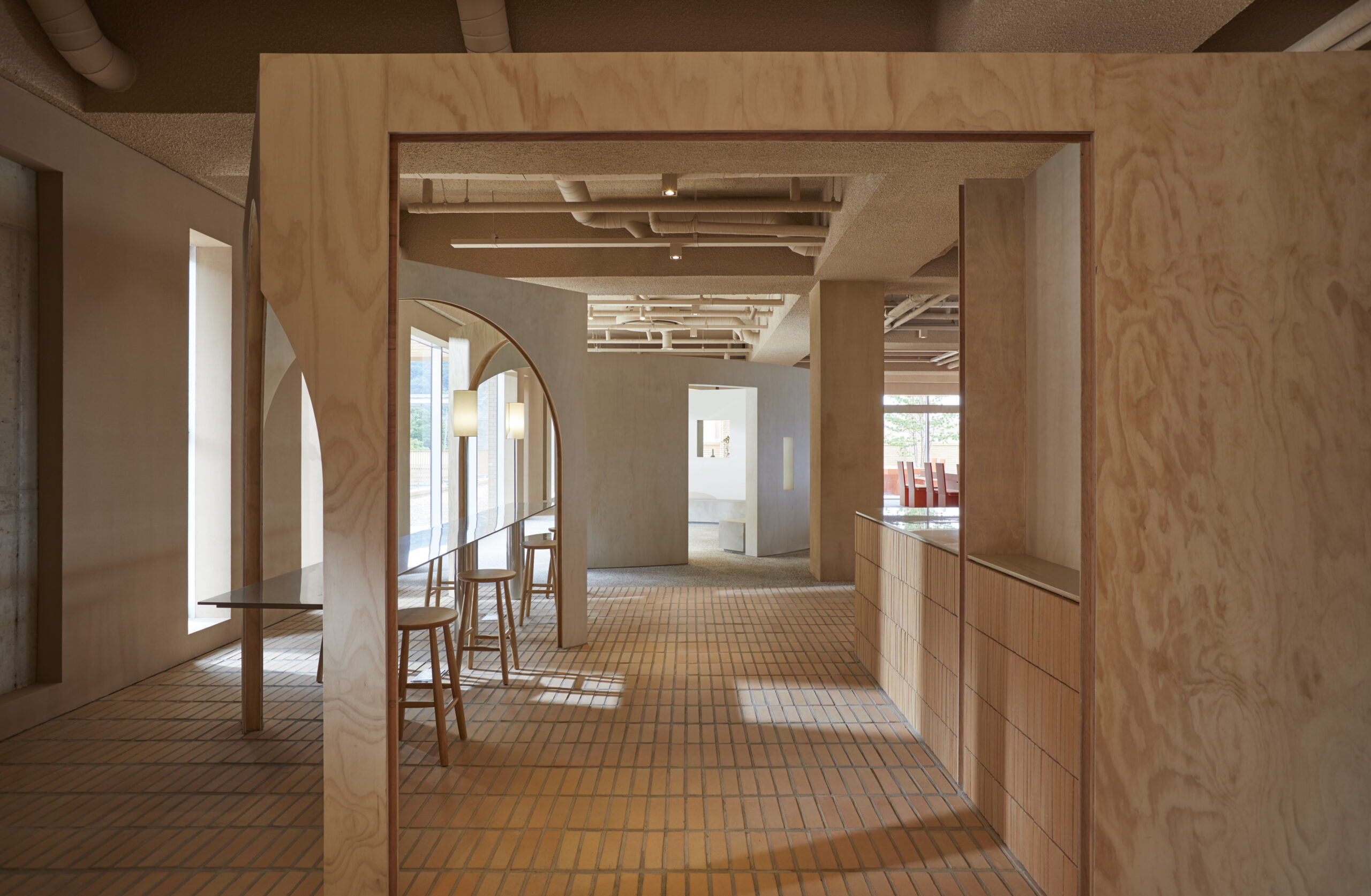
The first section you encounter is overlapping windows (representing a form of rest).
Photo: Park Woo Jin
©2021 ATMOROUND
Photo
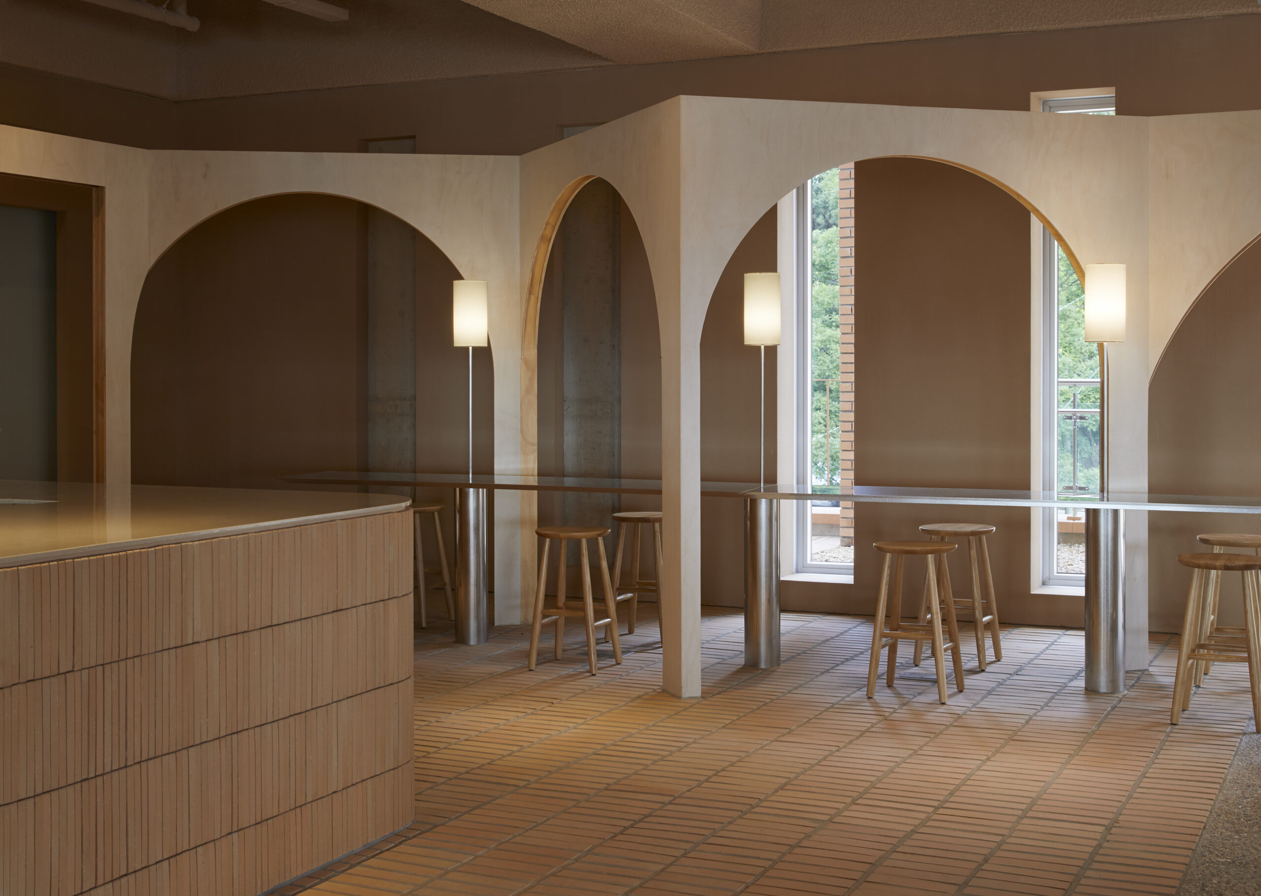
At the long table that crosses the overlapping windows, each person spends their own rest time with table lamps.
Photo: Park Woo Jin
©2021 ATMOROUND
Model
A partition created by folding and standing up a long wall with various windows.
Property of the atmoround
Made: atmoround
©2020 ATMOROUND

Branding
Visual branding work carried out as an extension of the spatial concept.
Branding supervision: atmoround
Visual Branding: sparks edition
©2021 ATMOROUND
Photo
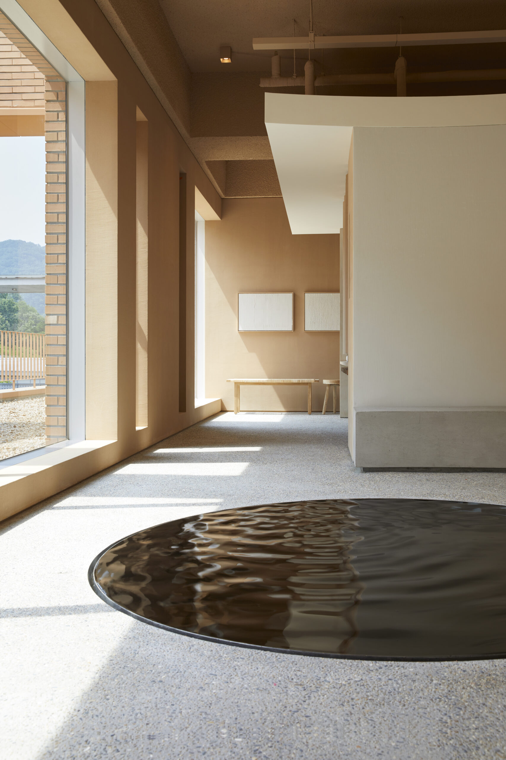
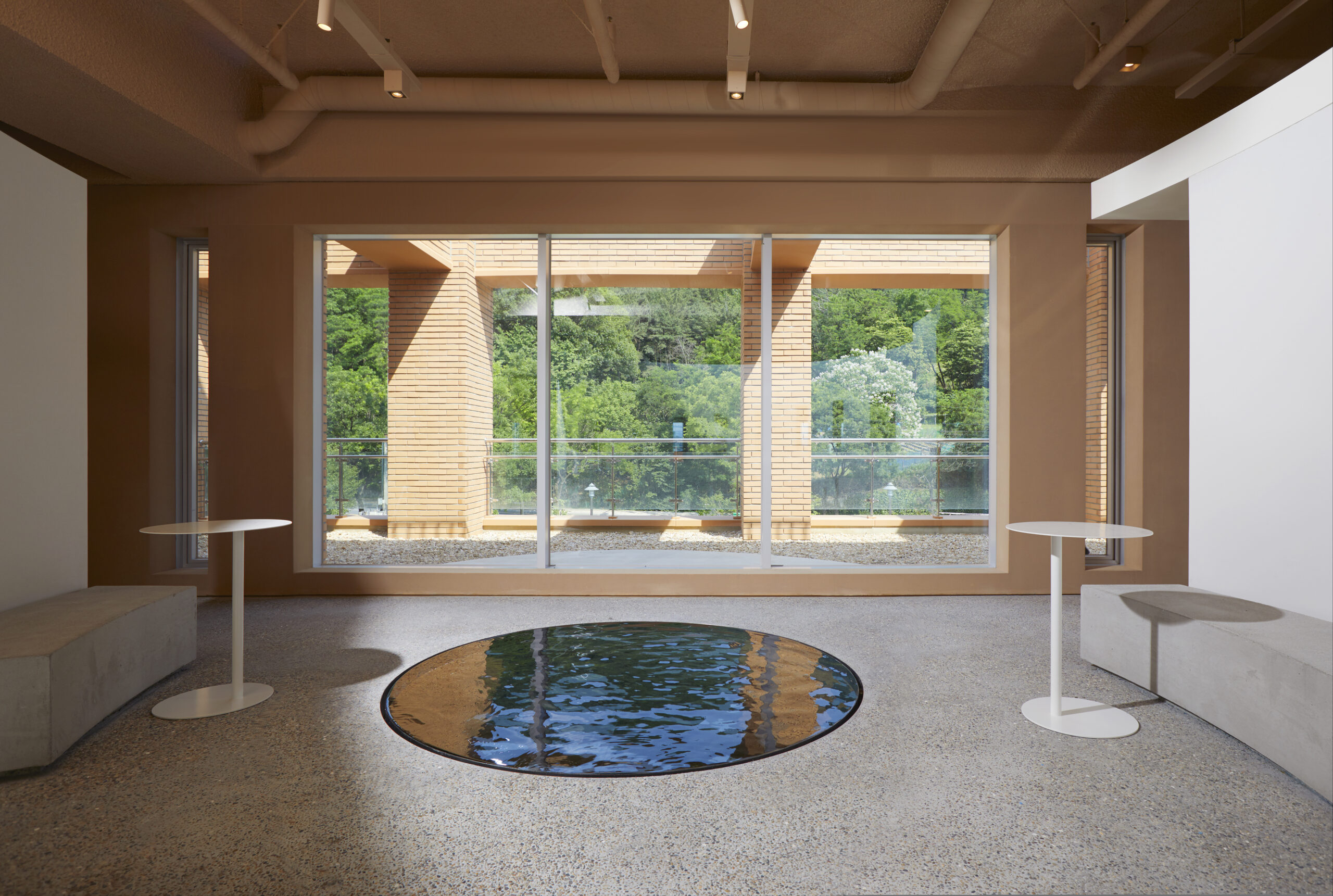
A window filled with light : The shallow water feature on the floor reflects the sky and the forest.
Photo: Park Woo Jin
©2021 ATMOROUND
Photo
A spot where you can rest while looking at Bomun Mountain located at the back.
Photo: Park Woo Jin
©2021 ATMOROUND
Photo
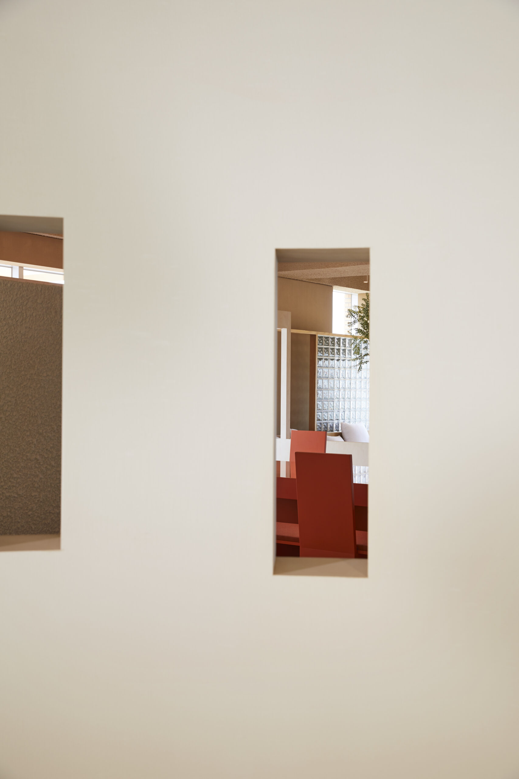
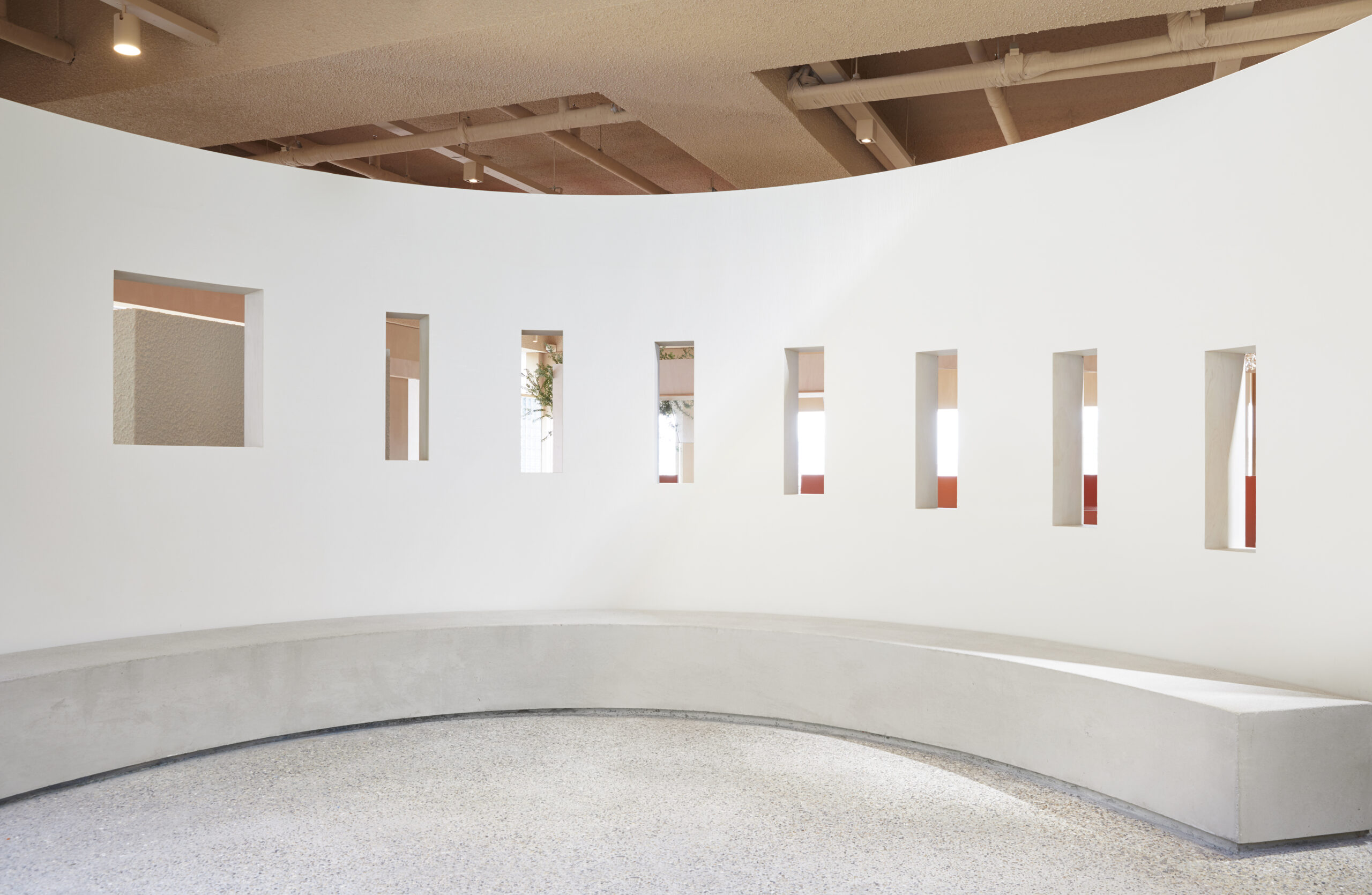
Windows of 'A window filled with light' partition.
Photo: Park Woo Jin
©2021 ATMOROUND
Photo
The circular wall filled with light has small windows repeated throughout, allowing glimpses of the interior and exterior.
Photo: Park Woo Jin
©2021 ATMOROUND
Photo
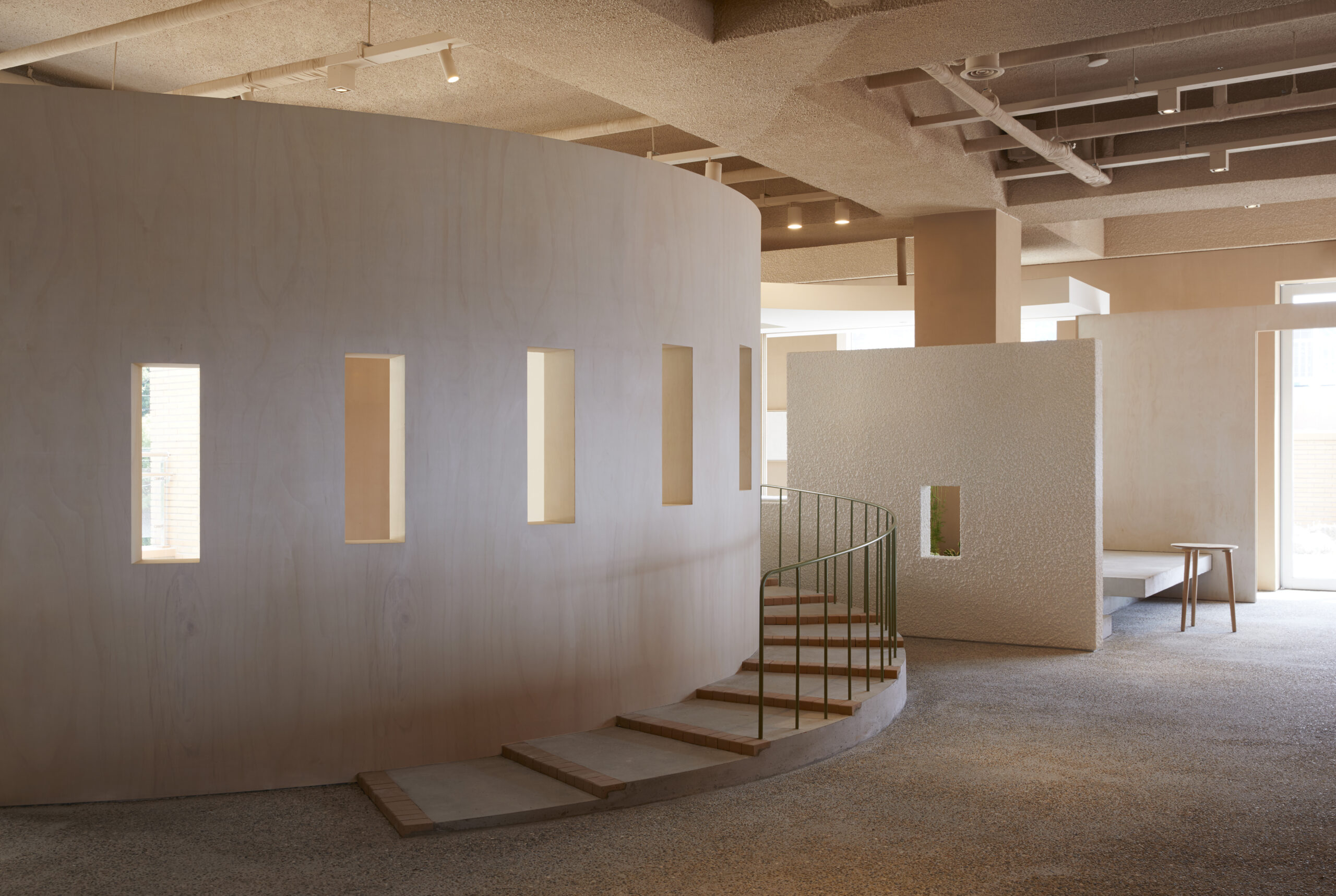
A view looking at both the "window filled with light" and the "window in the garden."
Photo: Park Woo Jin
©2021 ATMOROUND
Photo
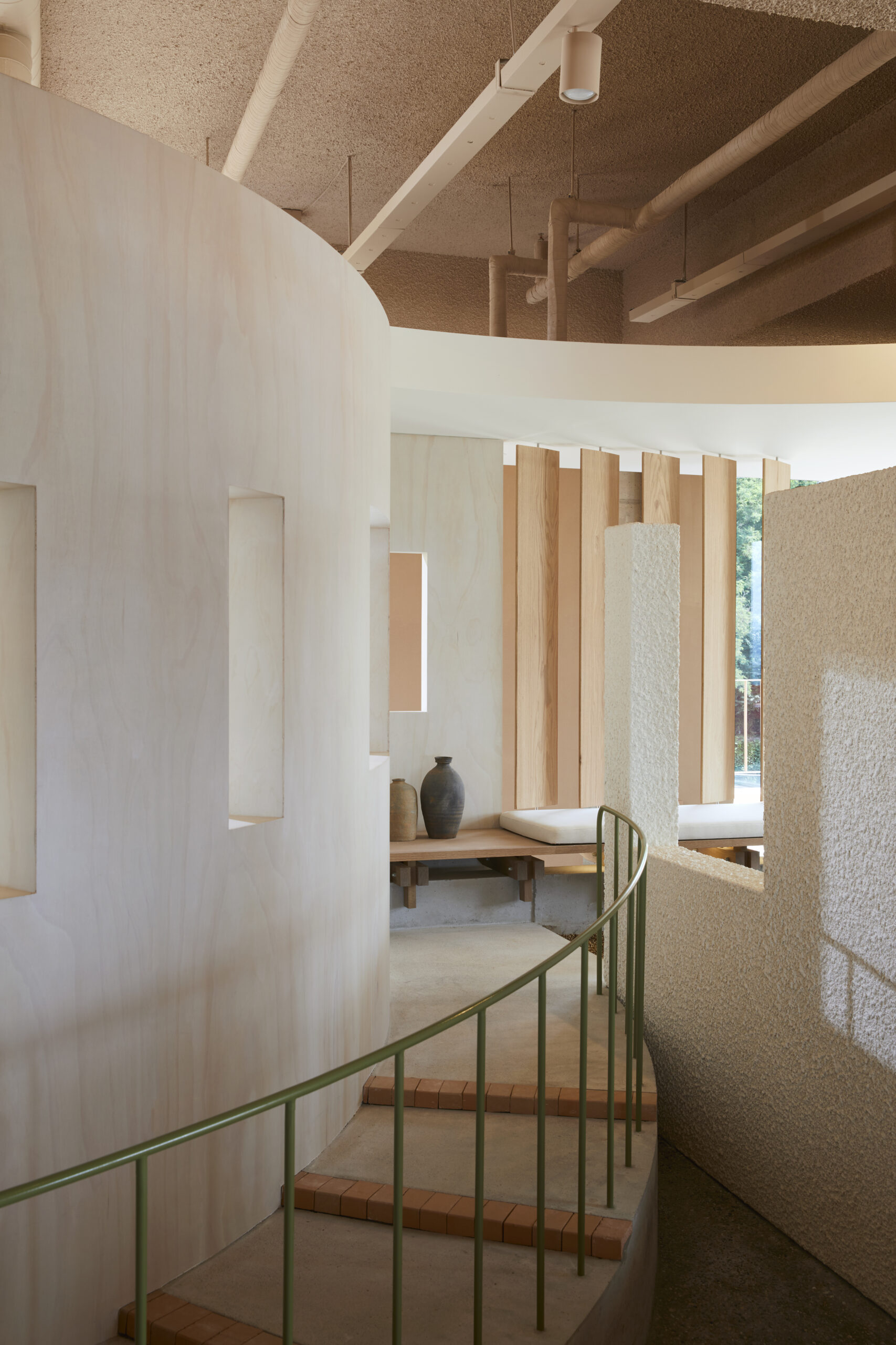
The stairs surrounding the "window filled with light" lead to the "window in the garden" area.
Photo: Park Woo Jin
©2021 ATMOROUND
Photo
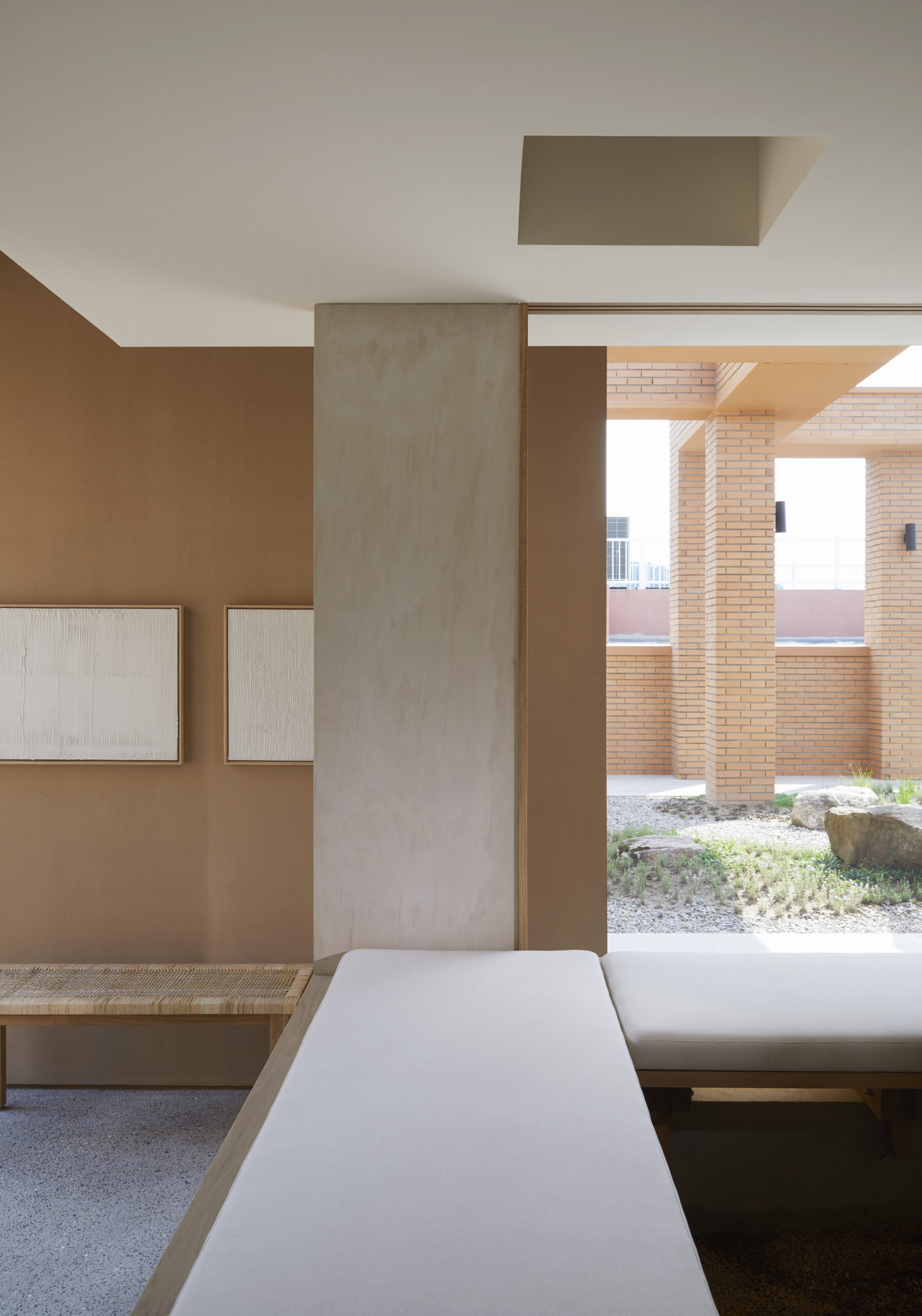
Through the window located behind the "window in the garden," light enters, revealing the plants on the exterior terrace.
Photo: Park Woo Jin
©2021 ATMOROUND
Photo
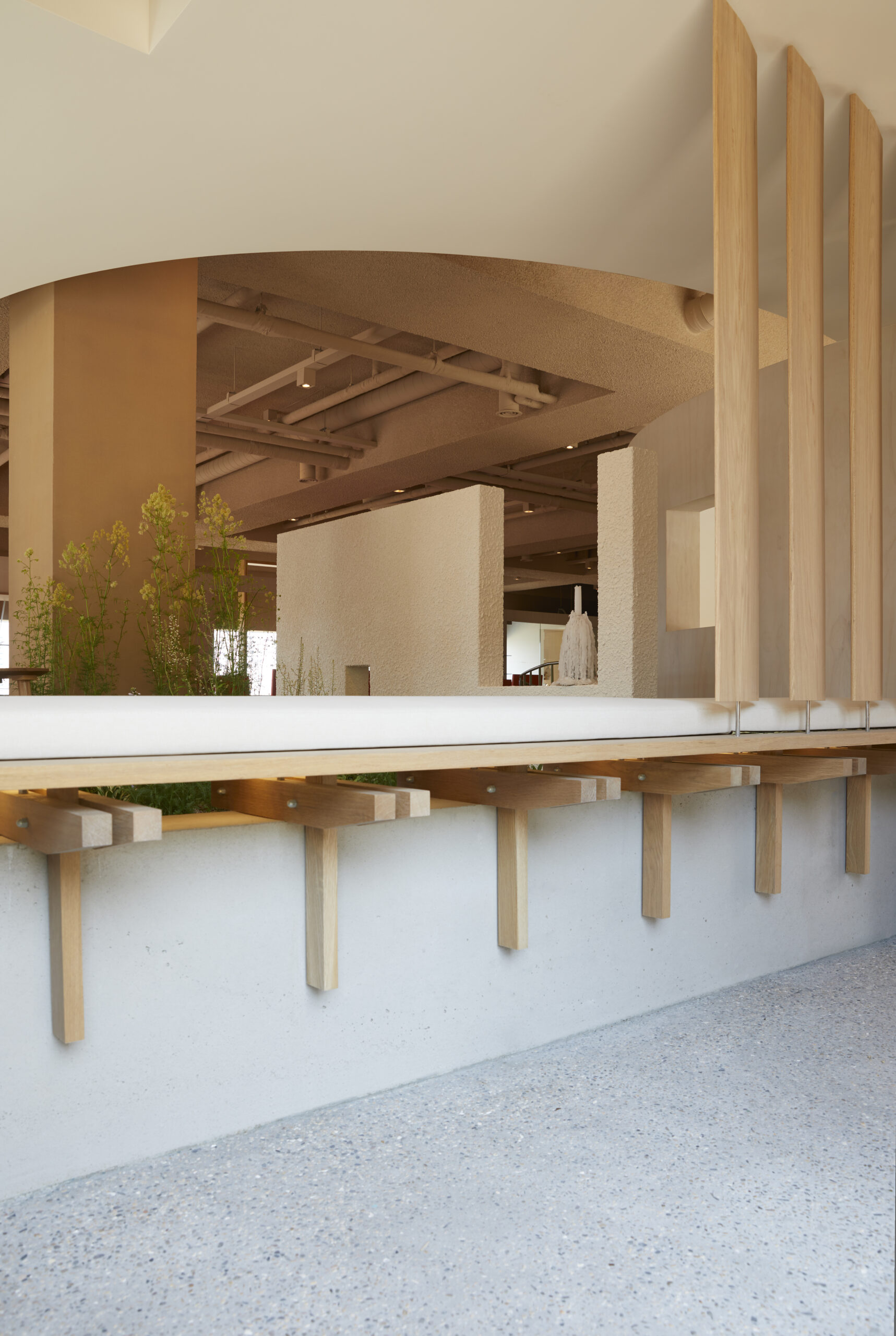
Inspired by the movie "This Beautiful Fantastic," the "window in the garden" is intended to be a space where one can rest by looking at flowers and enjoying their fragrance.
Photo: Park Woo Jin
©2021 ATMOROUND
Photo
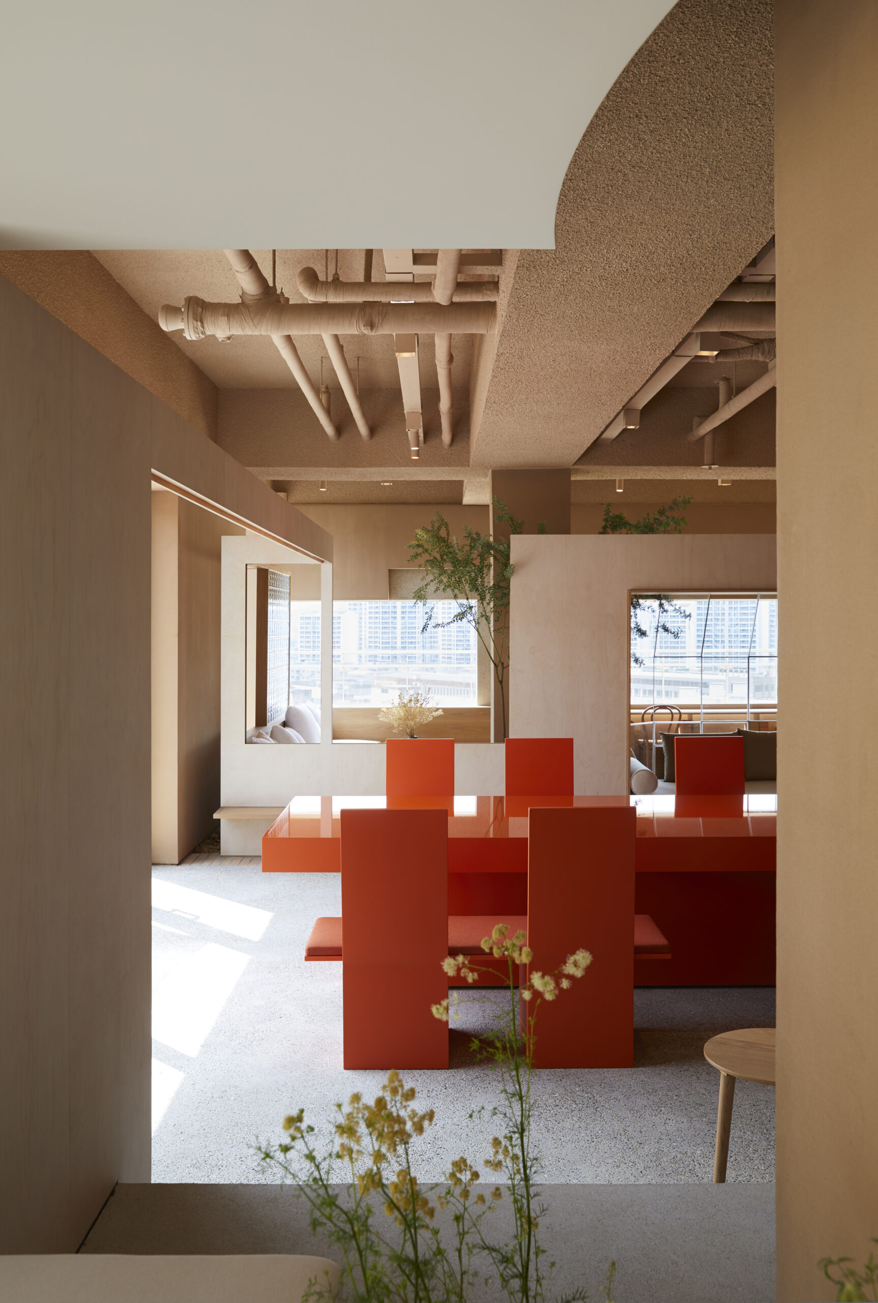
The scene viewed while sitting in the "window in the garden" area.
Photo: Park Woo Jin
©2021 ATMOROUND
Photo
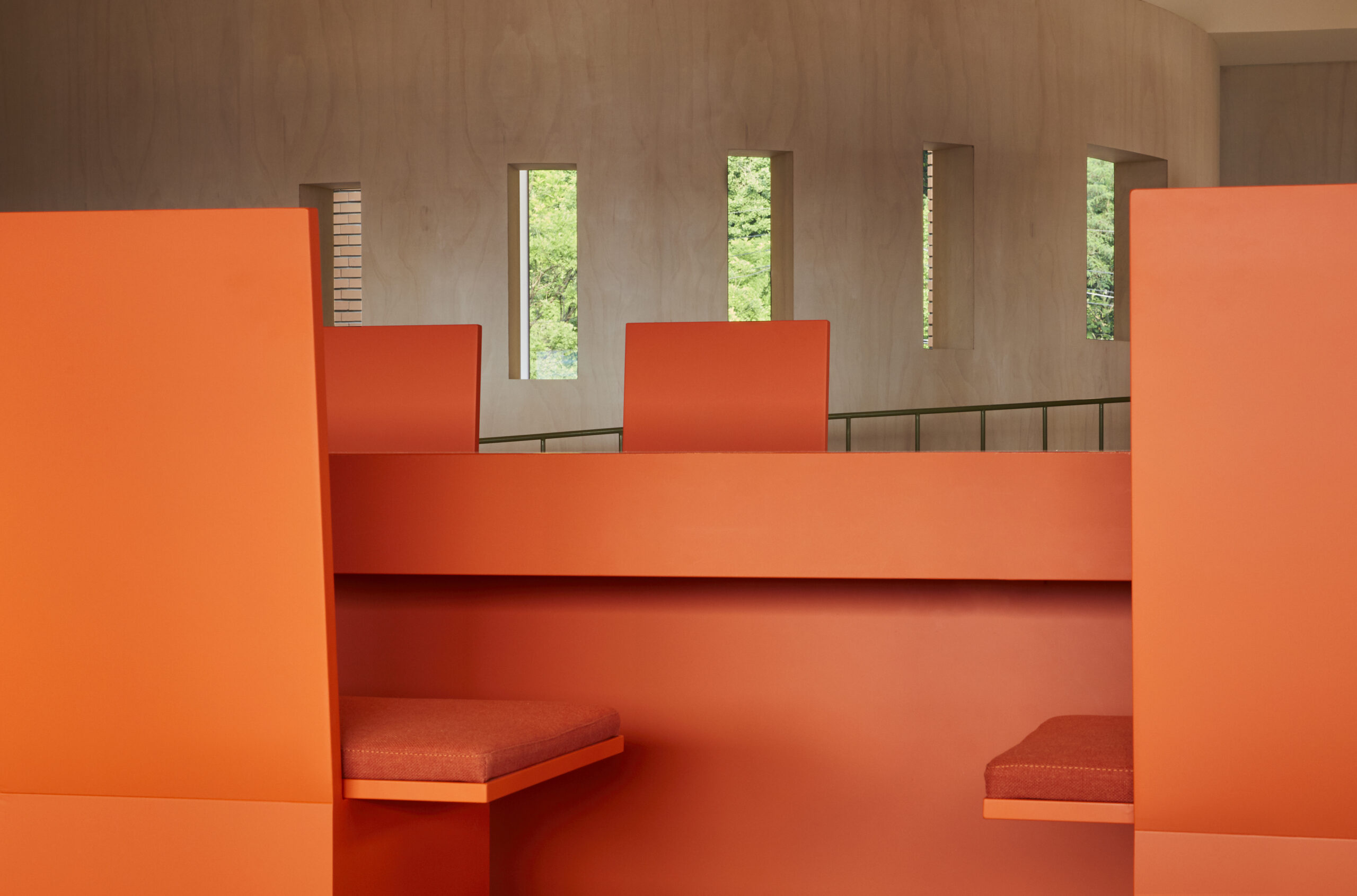
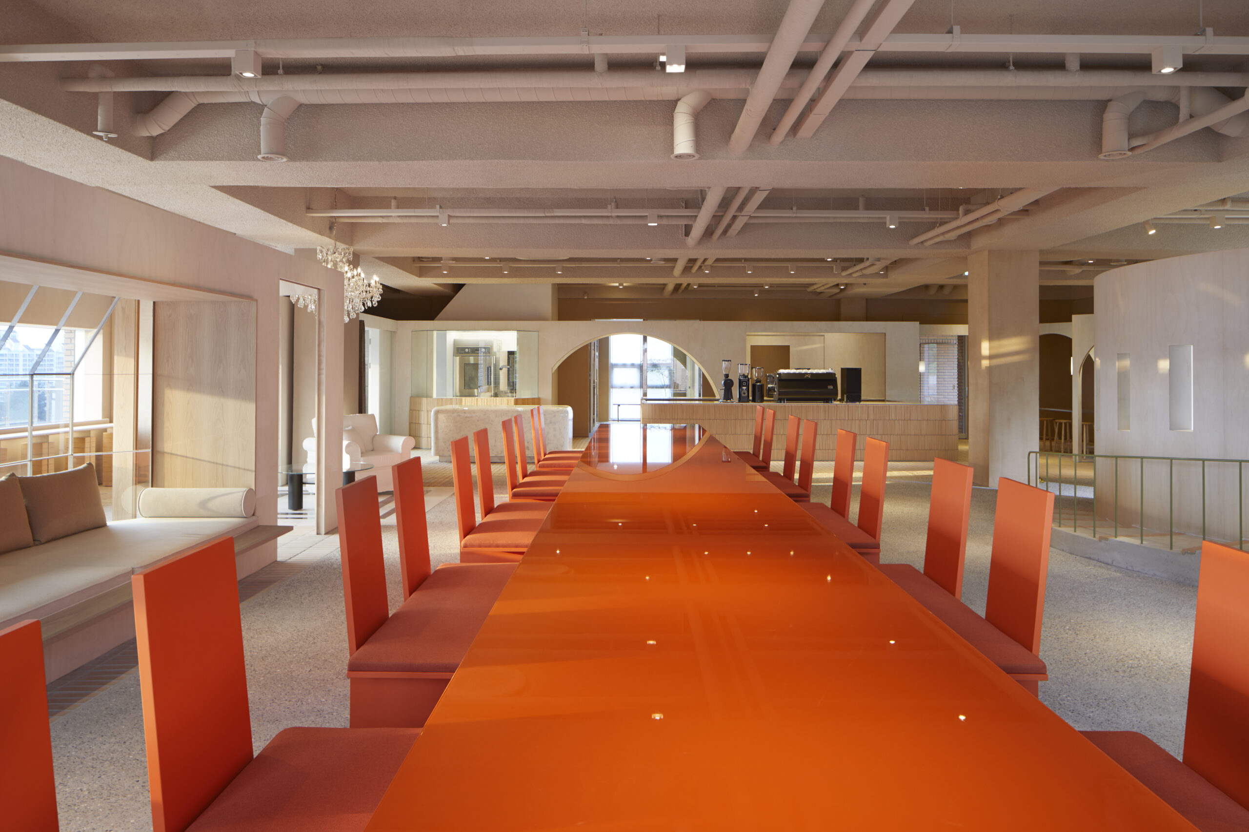
An orange-red table and chairs that run across the center of the entire space.
Photo: Park Woo Jin
©2021 ATMOROUND
Photo
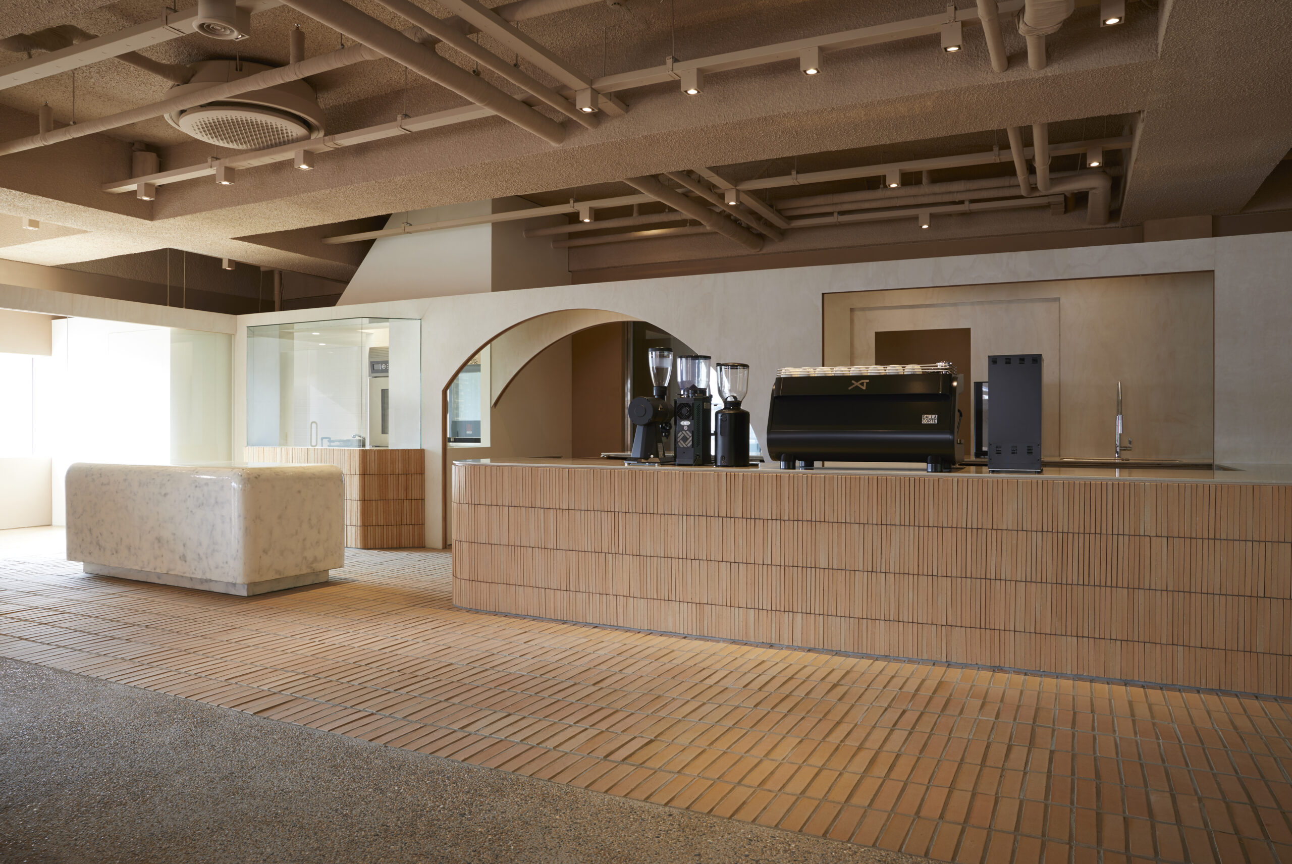
The main bar and bakery zone are not separate working areas but are interconnected as one of the various window scenes (the working window).
Photo: Park Woo Jin
©2021 ATMOROUND
Photo
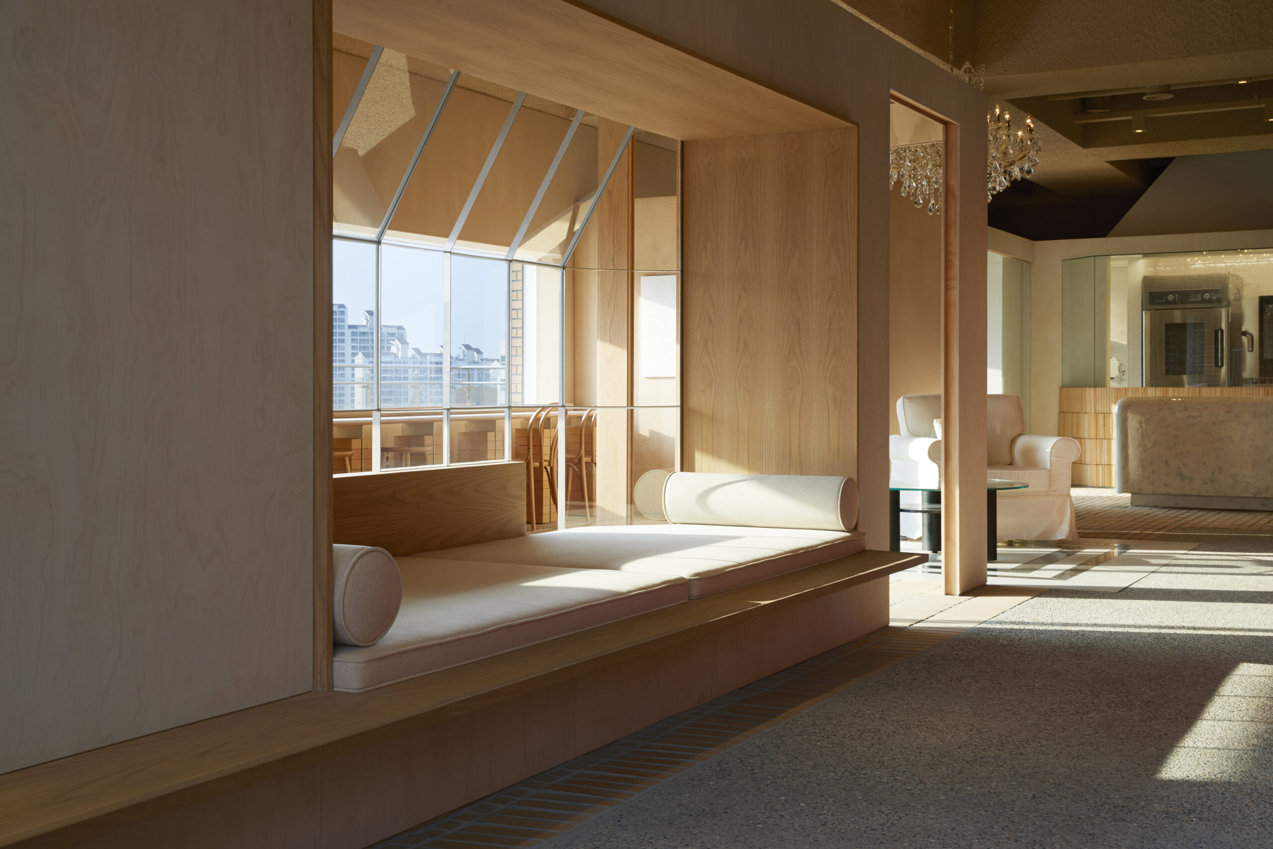
"The reclining window"
Photo: Park Woo Jin
©2021 ATMOROUND
Photo
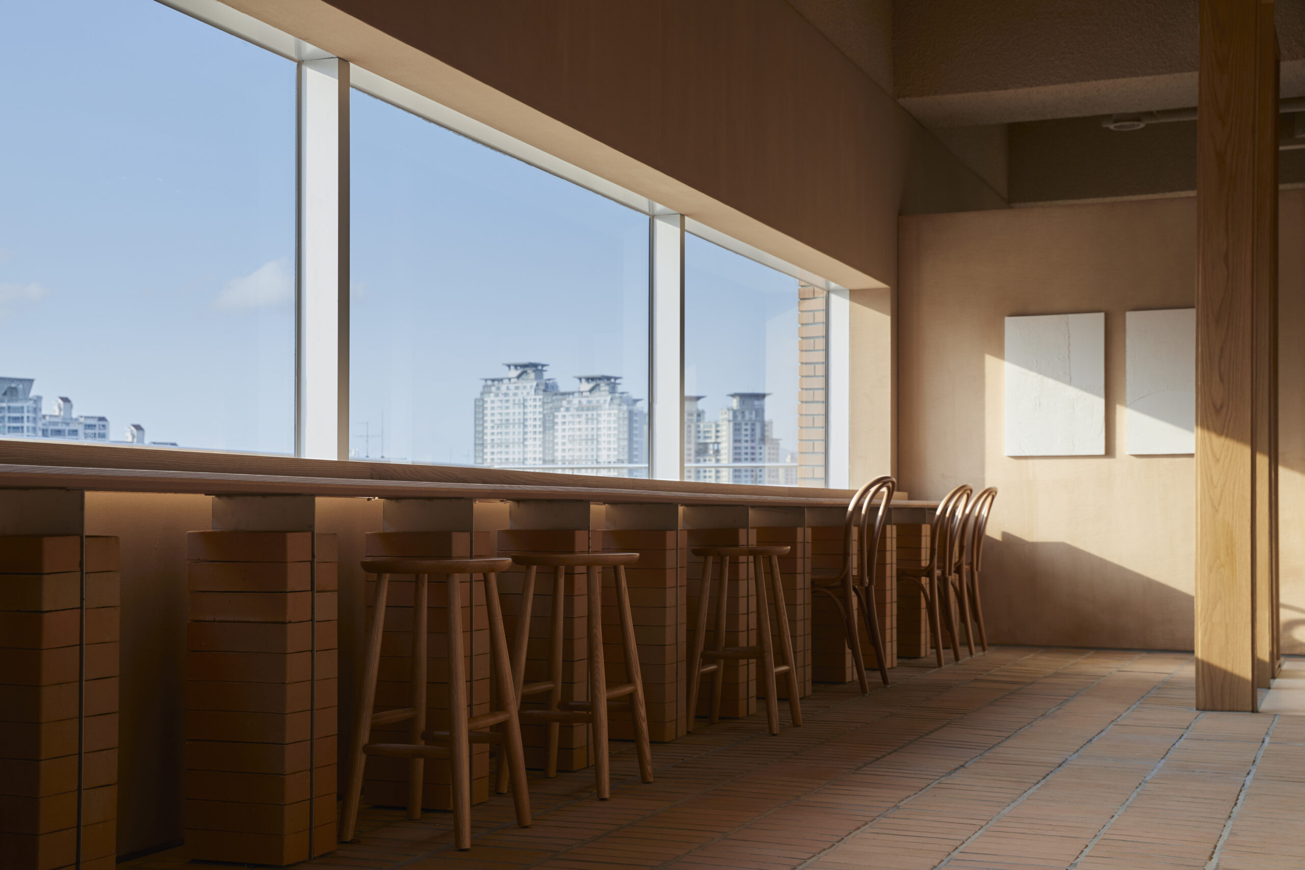
The "viewing window" envisions a resting scene where one sits leaning against the window sill. Unlike the other side, this window offers a view of the city.
Photo: Park Woo Jin
©2021 ATMOROUND
Photo
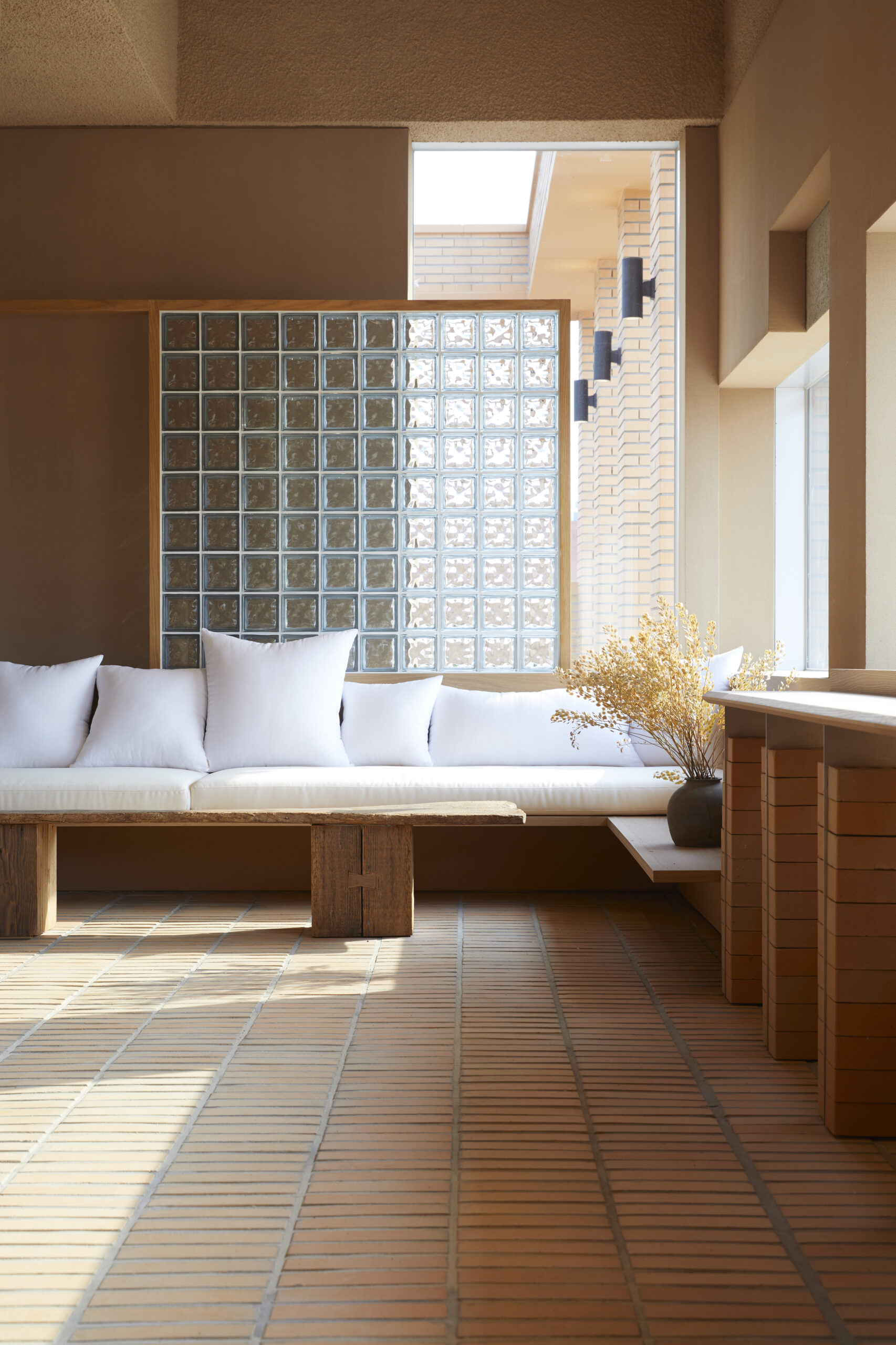
The "window where light scatters" is intended to be a place for restful relaxation as light breaks through. This is why it features glass blocks, natural booth sofas (with cushions), and a wooden table that conveys a sense of time.
Photo: Park Woo Jin
©2021 ATMOROUND
Photo
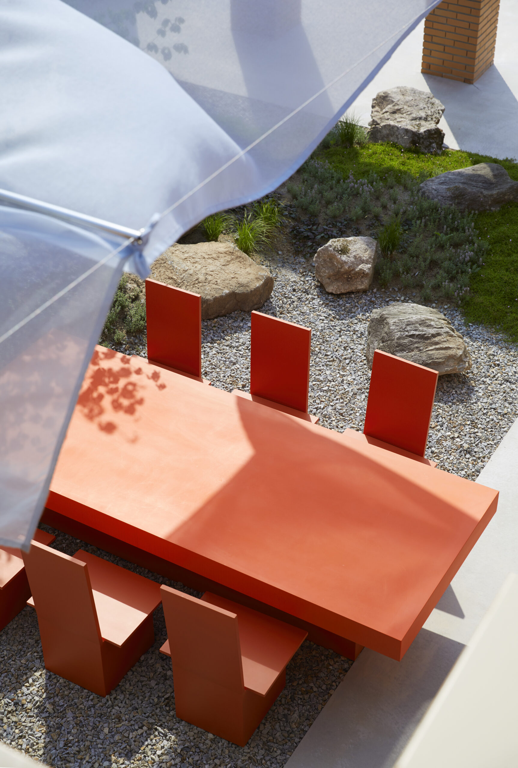
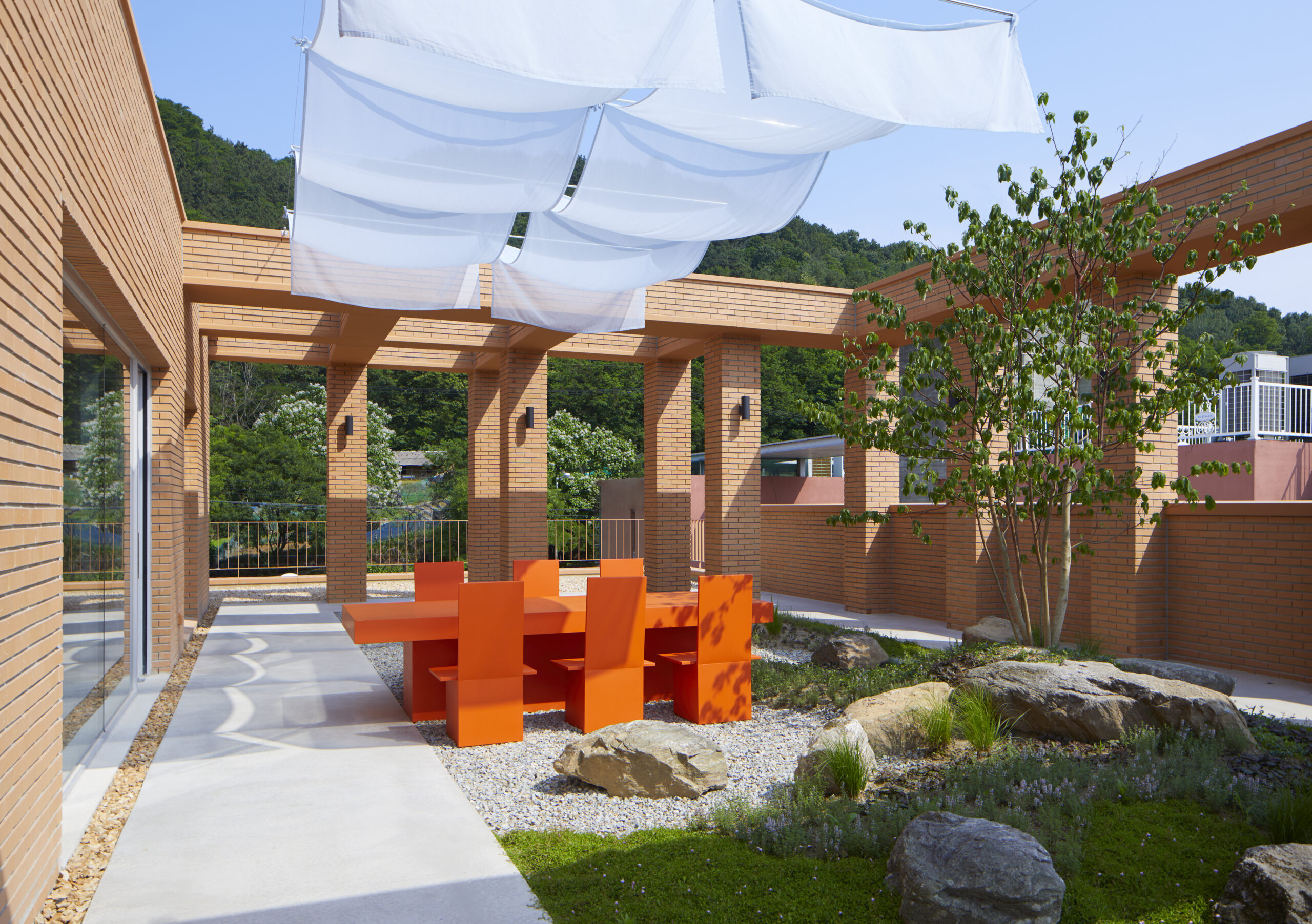
"The window in the wind": Extending to the exterior terrace, an orange table is situated beneath a canopy designed to allow the breeze to be felt.
Photo: Park Woo Jin
©2021 ATMOROUND
Photo
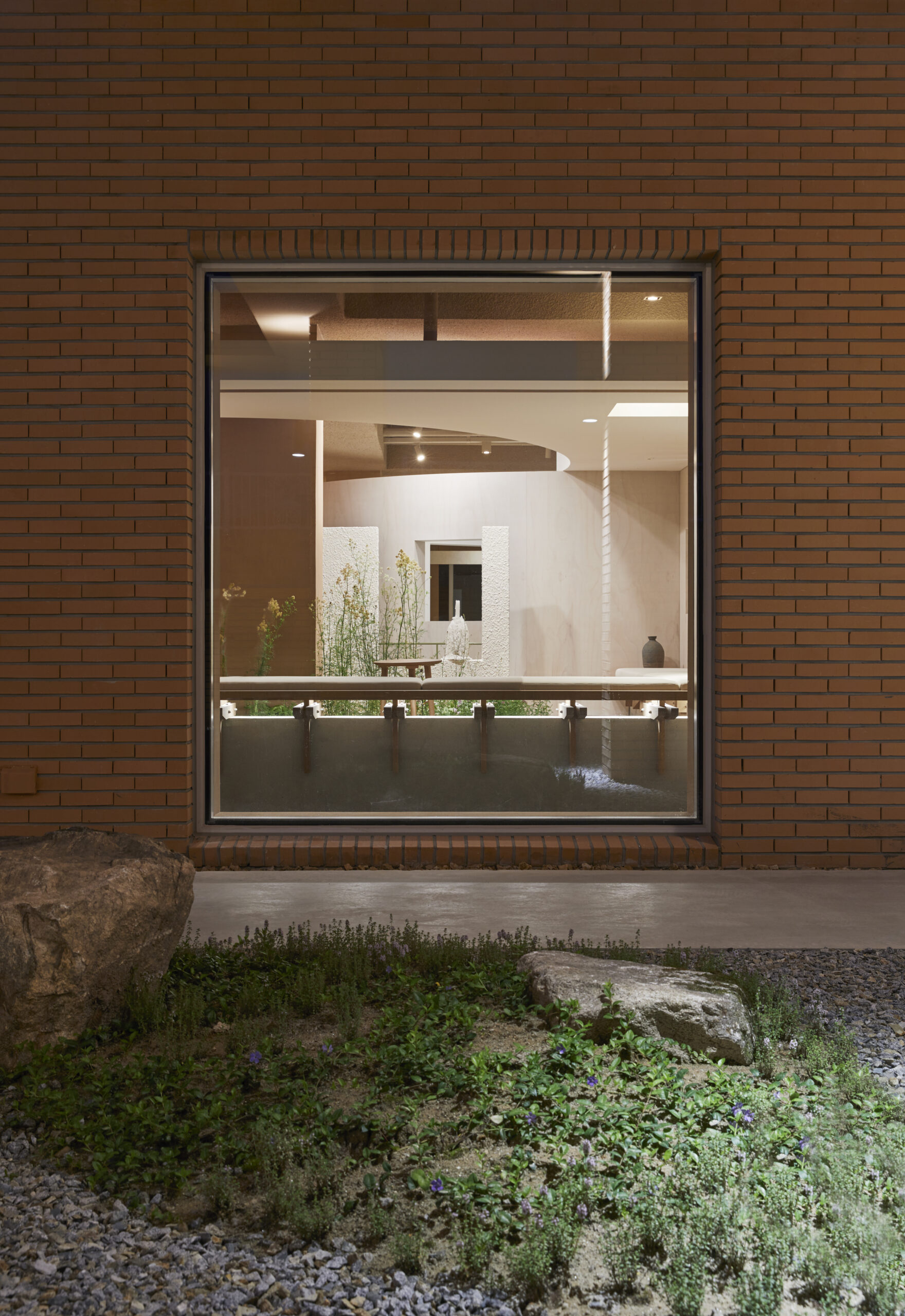
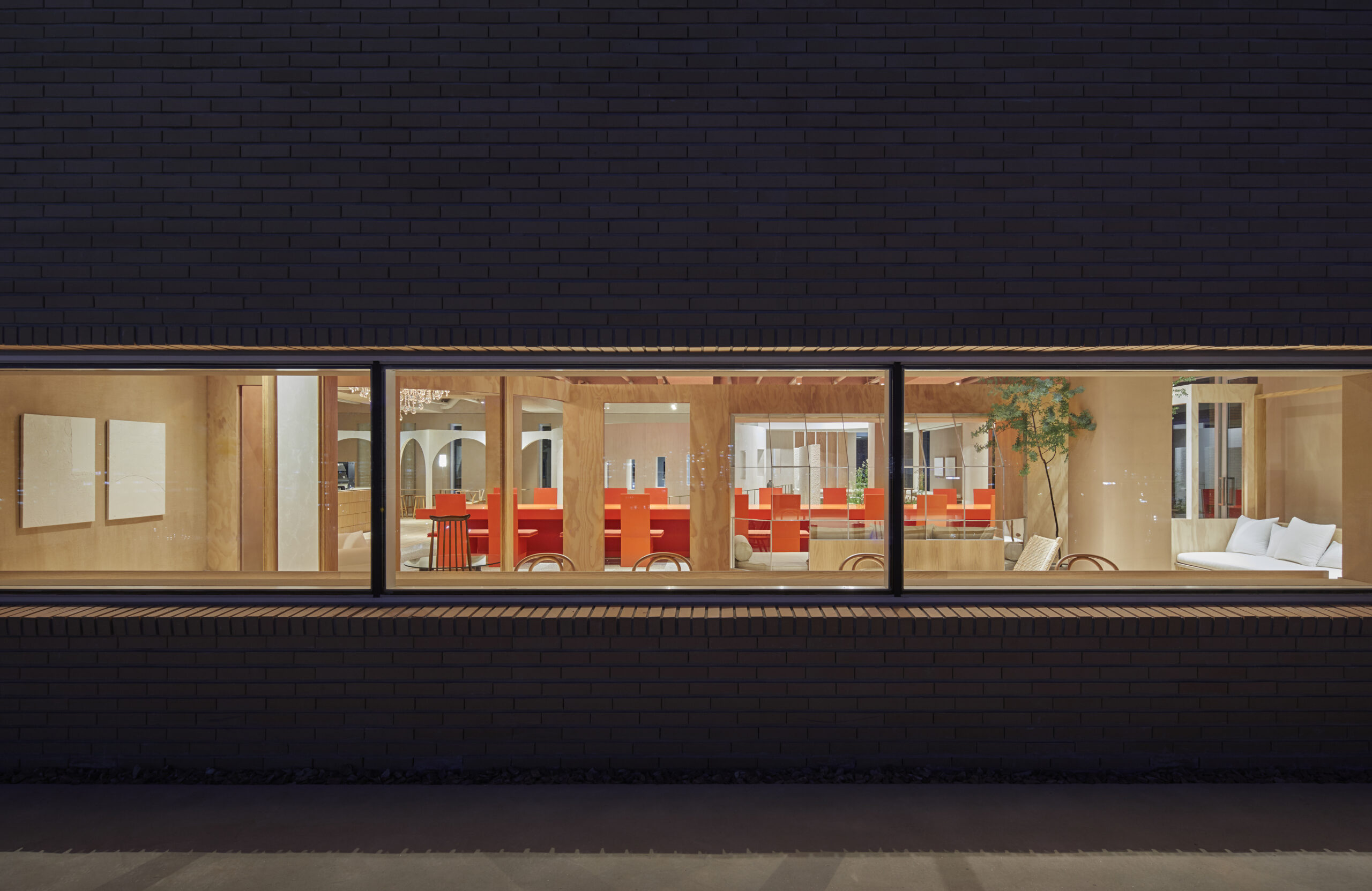
The view through the window capturing various forms of rest within MOSP.
Photo: Park Woo Jin
©2021 ATMOROUND
Category bakery cafe
Realize Architecture & space Design, Space Coonstruction,
Branding supervision
Completion Date 2021. 07
Location 27-5, munwha-dong, Jung-gu, Daejeon, South Korea
Graphic sparks edition
Landscape Anmadang The Lab
Photography Park Woo Jin
KR
각 창들이 의미하는 바
창을 통해 담기는 모습
모습을 담는 창의 모습
벽마다는 조금씩 다른 얼굴로 저마다의 표정을 짓고 있다. 내벽에는 별다른 장식이 없다. 모두 백색 톤으로 같은 재질이다. 사람 간에 깊고 진솔한 대화가 오갈 때 꾸밈없는 본모습을 보여주어야 진정성이 있는 것처럼 이 벽들이 짓는 표정은 꾸밈없고 솔직하다. 크기가 조금씩 다른 창들을 통해 공간의 모습들이 담긴다. 그 안에서의 모습들은 어느 때보다 솔직한 모습들이다.
EN
There are various form of relaxation. To capture this, we drew the diverse form of relaxation on a long sheet of paper, then folded another paper, having openings cut out by scissors, onto it. We built MOSP: a place that reflects each individual’s form of relaxation. Openings between these walls act as a vent, making the place a space of relationship, not a confinement. “MOSP”, located in Daejeon city, is under the foot of a mountain. Daejeon’s downtown can be seen from the front, and Bomunsan Mountain from the back. MOSP is located on the top, fifth floor of the building. There are gentle stairs that flow from the ground of Bomunsan up to the cafe, which naturally lead visitors inside. The building has somewhat vertical mass when viewed from the opposite side of Bomunsan. However, when you enter the café from Bomunsan, you’ll experience a low and gentle horizontal mass. Upon entering, the view of downtown Daejeon that unfolds from the terrace feels extraordinary. As you climb the gentle stairs, you’ll see that there is a sense of comfort infused in the interior of the café. We wanted the cafe to be spacious, but not vastly extensive. We wanted a cozy place for people to comfortably relax. We set up a long connected partition having openings and windows to reflect the diverse methods of relaxation.